‘O’ Followed by ‘A’, ‘S’, and ‘E’
Of the changes initiated by the redesign of OASE, the format is the only decision that has endured in every issue since Karel Martens’ appointment as designer in 1990. Previously set to A4 (210 x 297 mm), a paper size regulated by the International Organization for Standardisation (ISO), the updated, smaller format (170 x 240 mm) aligned OASE closer to the dimensions of a journal, making it easier to hold and read given the significant amount of text. While the reading experience was surely a priority, the decision to modify the format also responded to production needs, allowing for a more economical use of Dutch printing presses. The paper sheets from the press would now yield a section of eight pages when folded in half three times and then cut along the fold. Of course, limiting waste in production relieves some financial pressure, but attention to material concerns also stems from a modernist impulse to standardise processes. In addition to the format, other formal conventions such as choice of typeface may tempt one to identify OASE as a modernist journal. But there is another story to be told about the socially committed practice of Karel Martens, whose uniquely iterative approach to graphic design critiques a contemporary landscape dominated by templates and style-guides.

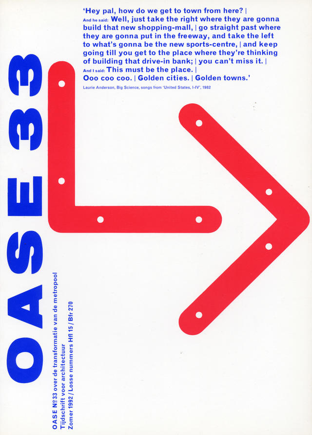
OASE 33, Cover / Omslag
While Karel may be a ‘descendant of Modernism’, 1 his approach to typography interrupts the overly rational, predictable forms associated with post-war era graphic design. In an interview published in Printed Matter, Karel elaborates on his relationship to modernism over the course of his career:
I realized that identity, in order to make a distinction, has precisely to do with differences and diversity. Although I still believe modernism has brought valuable insights, I reacted in my work against the formal consequences it dictated. 2
The modernist convention of using sans-serif typefaces certainly runs through the magazine, and includes Karel’s go-to MT Grotesque. But unlike the standardised format, the typography of OASE is anything but fixed: each issue’s cover is drastically unique, and its grid and interior layout are continuously adjusted. Karel notes that he ‘never wanted to use a sacred and uniform logo for the magazine OASE’, but instead ‘always tried to design each new issue from out of its specific content’. 3

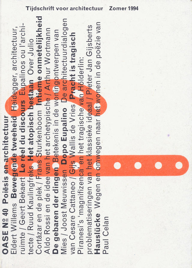
OASE 40, Cover / Omslag
The visual identity of OASE begins anew with each issue. The journal’s editors assign a theme that writers then unpack, and in concert with their work, Karel develops a new cover, grid and layout. As the editorial for ‘OASE 75: 25 Years of Critical Reflection on Architecture’ notes: ‘Even if one could set out on an endeavour to define categories of interests over the years, any attempt to circumscribe a clearly defined, long-term editorial agenda would prove unrewarding.’ 4 The mutable typography also responds to the complexity of the journal’s content, which since 1992 has included English translations of the Dutch text. As a result of this process, the variegated forms and improvisational strategies that emerge become an apt representation of the journal’s evolving identity.
Karel’s approach is thoughtful in its communication of content, but it also treats the journal as an expressive site for experimentation with form and colour. In fact, OASE may be considered an authoritative, public document of Karel’s design practice as a whole. If one considers the journal as a chronological series, one can track Karel’s tenure at the Werkplaats Typografie, the post-graduate graphic design school he co-founded in 1998. Beginning in that year, with OASE 48, Karel designed each issue of the journal in collaboration with a different student. He encouraged each student to leave their unique mark on the publication, making the journal a record of a focused period of instruction. Objects from Karel’s personal collection of found metal detritus also make appearances in the journal, for example on the covers of OASE 33 and 40, connecting the journal to his large, separate body of work involving the printing of those objects.
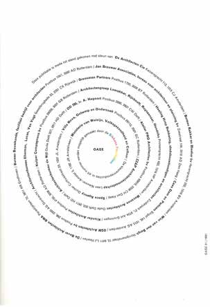
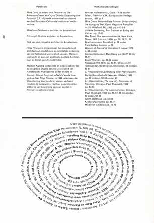
That is not to say the journal becomes a mere repository. It is also an opportunity for expansions and modifications of Karel’s design method. For example, I recently asked Karel about the list of sponsor names set in a spiral which sometimes appears in the journal’s back matter. The spiral first appeared in OASE 31, and it recurred in a few subsequent issues. When it first appeared, only one sponsor’s name was printed in a gradient of colour: Sikkens, the Dutch paint company. Like most independent journals, OASE is limited in its budget and typically prints in black-and-white. In this particular issue, however, Karel wanted to honour the paint company’s sponsorship of the four-color printing of a section dedicated to Rossi’s Museum. Significantly, Karel also commented that his setting the list as a spiral was contemporaneous with his learning how to set letters on a curved baseline in Adobe Illustrator.

OASE 31, Sponsor list / Sponsorlijst

OASE 34, Sponsor list / Sponsorlijst
These instances demonstrate a responsive design practice encompassing an evolving set of interests, moments of technical discovery and generally changing conditions. The journal’s design affords its subscribers the opportunity to witness the decision making involved in its production, reflecting Karel’s commitment to his public:
As a designer you are always working for a public. Personally, I like to see the public as erudite and noble. To keep that in mind is very helpful for my considerations and the decisions I have to make during the design process. I like to treat the public with respect, dignity and responsibility. As moral people. Besides a lot of pleasure in doing the work, these are my parameters. The hardest thing is to find a client with the same intentions. 5
The transparency of interaction between producer, product and public has affinities with Robin Kinross’s description of the emergence of modernism in printing and typography:
Printing becomes modern with the spreading of knowledge about itself: with the published description of its practices; with the classification of its materials and processes; with coordination of dimensions of materials, enabling their exchange and better conjunction; with the establishment of a record of its history. 6
OASE is a visual record of its own history and production processes. Yet it also goes beyond this definition of modernism. In a separate article involving Karel’s work, Kinross considers how typography manifests as ‘a social act that provides a forum for dialogue and exchange’.7 The formal details of the journal including the format and choice of typeface are only traces of a larger commitment on the part of its designer.
Karel’s work explodes a definition of modernism primarily identifiable in terms of formal conventions. As such OASE represents a typographic project committed to engaging the public beyond the presentation of a fixed, reductive identity. The hundredth issue of OASE, while a milestone anniversary, is just one more iteration of an intentionally responsive and continuous project. Five years before Karel’s appointment as designer, between the tenth and eleventh issues, the journal changed its name from ‘O’ to ‘OASE.’ In a sense, then, even the journal’s name contains a history of itself – ‘O’ followed by ‘A’, ‘S’ and ‘E’ –an apt metaphor for Karel’s strategies of continuous experimentation. Those strategies are tirelessly committed to an engaged public, setting the social function of graphic design and typography within OASE’s production.
Notes
Hugues C. Boekraad, ‘Karel Martens: Meticulous and Personal, Judges’ Report, H.N. Werkman Prize 1993’, in: Karel Martens: Printed Matter (London: Hyphen Press, 1996, 2001, 2010), 189.
Michael Cina, ‘Karel Martens and Education: Email Interview by Michael Cina, Baltimore 2005’, in: ibid., 193.
Ibid.
Pnina Avidar et al., ‘A Magazine of Neither / Twenty-five Years of OASE’, OASE, no. 75, ‘25 Years of Critical Reflection on Architecture’ (2008), 5.
Cina, ‘Karel Martens and Education’, op. cit. (note 2), 193.
Robin Kinross, Modern Typography: An Essay in Critical History (London, Hyphen Press, 1992/2004), 16.
Robin Kinross, ‘Let the Object Speak’, Eye, vol. 3 (1993) no. 11, eye-magazine.com/feature/article/let-the-object-speak.